Design Principles
Design that feels
distinctly AVI-SPL.
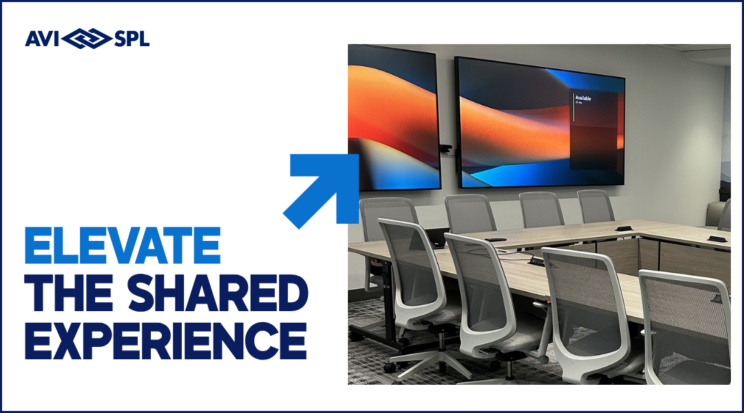
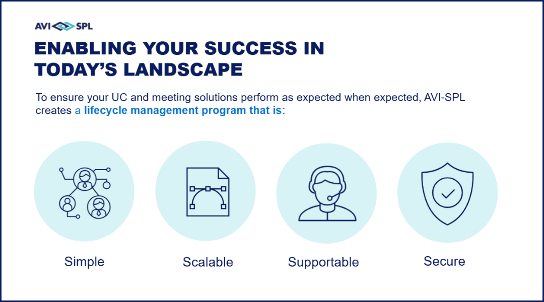
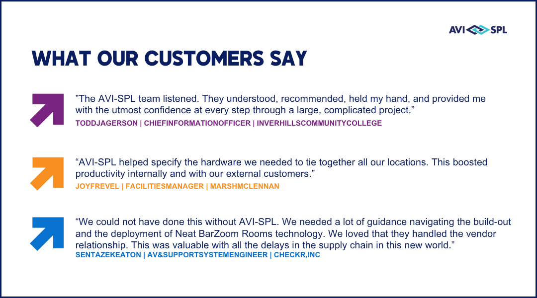
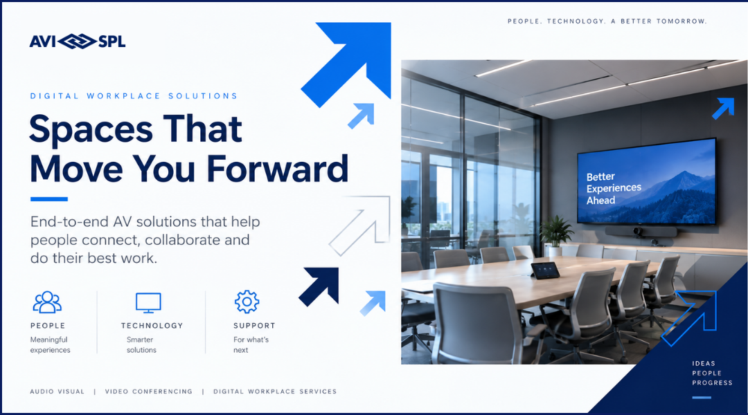
Our visual identity is more than individual colors, fonts, photography, and brand elements. How those elements work together is what makes a design feel distinctly AVI-SPL. Think of these principles as a practical recap of our visual guidelines above.
Use them when creating or reviewing AVI-SPL materials to make sure the fundamentals are working together and the final design feels clear, human, modern, and consistent.
Bringing It All Together
Strong AVI-SPL design is not about using more brand elements. It is about using the right elements, in the right way, to make the message clearer and the experience stronger.
When our typography, photography, color, layout, and brand elements work together with purpose, the result should feel:
- Clear
- Human
- Modern
- Intentional
- Distinctly AVI-SPL
The best designs are often the simplest ones. Prioritize the message, remove what does not add value, and let the brand come through in the overall experience rather than through decoration alone.
Key takeaway: Design with purpose. Keep it simple. Make it feel unmistakably AVI-SPL.