

Visual Design

Visual Design

Overview

AVI-SPL’s brand device uses arrows inspired from our logo mark to suggest guidance, leadership and progress. Our device is flexible in direction and color to imply adaptation and challenging conventions for better results. Our customers come to us looking for a solution that is continuously evolving — and our brand device delivers on that promise of confidence.

Visual Design

The Arrow

The AVI-SPL brand system is derived from the logomark. The arrow is a core element of the AVI-SPL brand and represents the guidance, leadership and innovation that inspires our clients. Keep the following guidelines top of mind when moving into design.

Weight

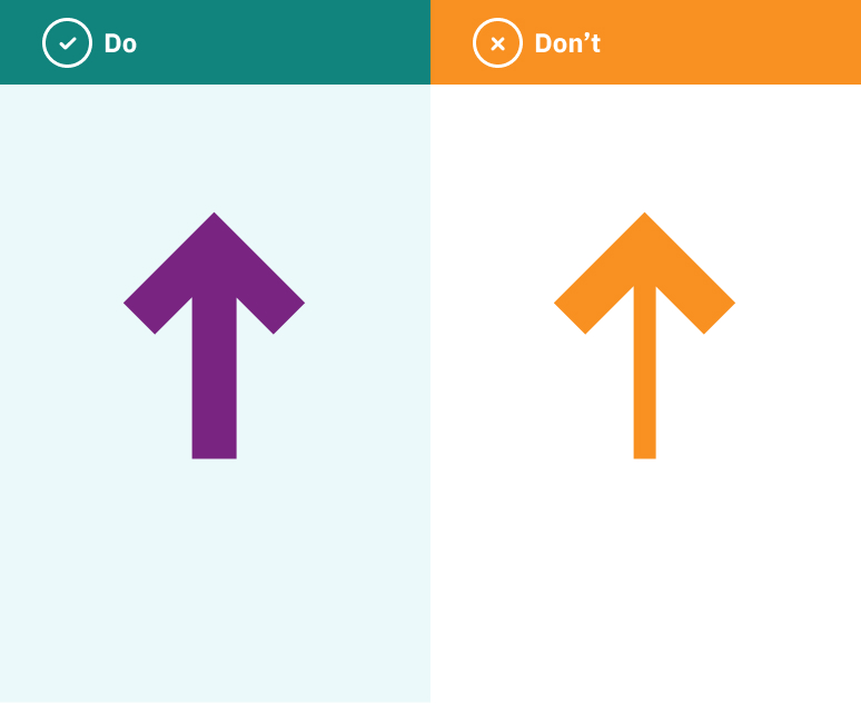
Arrows should have equal stroke weight and use a pointed tip in each application.

Shape

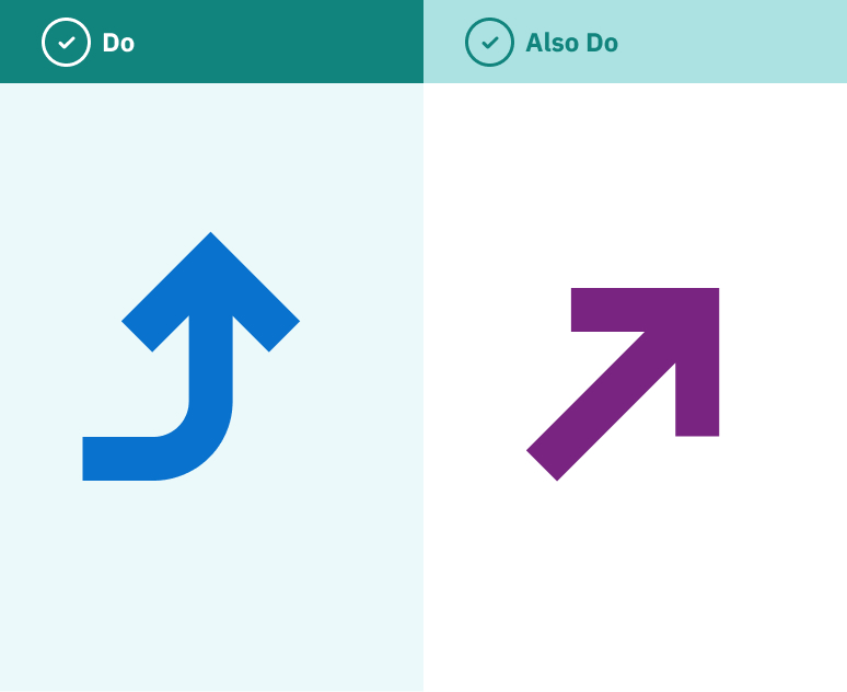
The tail of the arrow can be manipulated in both length and curvature depending on the composition or layout.

Color

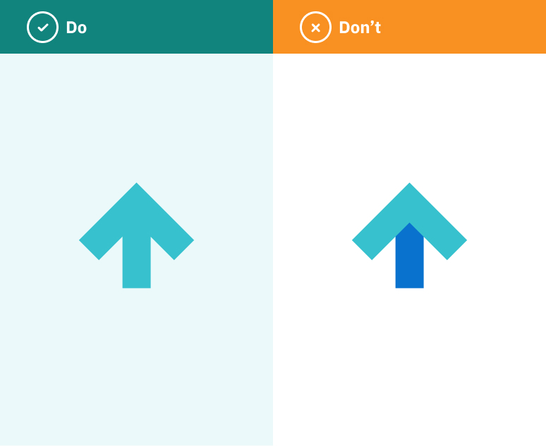
Arrows can be applied in a variation of brand colors, but never use gradients or multiple colors within a single arrow. The tip and the stem should always be the same color.

Direction

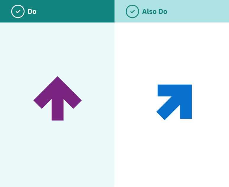
Arrows can face any direction. Use them to create hierarchy and direct the user’s eye to important content, or simply as a graphic element within layouts.

Visual Design

Dos and Don’ts

Do

  • Use arrows to guide attention, create hierarchy, or add intentional movement within a layout.
  • Keep the arrow stroke weight consistent and always use a pointed tip.
  • Keep the arrow tip and stem the same color.
  • Use approved AVI-SPL brand colors for arrows.
  • Allow arrows to face any direction when it supports the flow and hierarchy of the design.
  • Maintain a balanced composition when combining arrows with logos, icons, photography, typography, or other brand elements.
  • Position arrows around important content so they guide attention without interfering with it.

Don’t

  • Overuse arrows within a single layout. One purposeful arrow is often stronger than several competing arrows.
  • Use multiple arrows that point in competing directions or create confusing visual movement.
  • Stretch, distort, or disproportionately resize the arrow.
  • Use gradients or multiple colors within a single arrow.
  • Make the arrow tip and stem different colors.
  • Cover faces, logos, technology, text, or other important content with arrows.
  • Add shadows, glows, outlines, 3D treatments, or other effects to arrows.
  • Alter the established arrow style or create new variations that fall outside the approved construction.
  • Add an arrow simply to fill empty space or because “AVI-SPL uses arrows.”
  • Let arrows overpower the message or become the focal point when they aren’t intended to be.

Visual Design

Plus Grid

AVI-SPL’s plus grid is a graphic element, created from the tips of two arrows, that represents the foundational guidance they provide.  When combined with an arrow, the grid showcases how AVI-SPL helps their customer navigate challenges towards innovative technology solutions. The plus grid can be layered into photography or used as a graphic background element. It can be used with arrows and without arrows. If arrows are used with it, they should align to pluses on the grid.

Visual Design

CTA Button Style

Buttons should use title case. Buttons should look consistent but color can vary based on layout. Ensure you're using high-contrast pairings to ensure buttons are accessible and easy to read.

Primary Button

Secondary Button

Visual Design

Alt Button Styles

Tertiary Button

Tertiary Button - Hover